Tuesday, 27 October 2015

Practical Work Proposal

Overview

The practical element of my CoP investigation will be a smallish publication documenting the notes I took during my research and a final copy of my essay. The idea of it being a publication in itself is representative of Nietzschean principles because it's a celebration of the individual achievement (being my work), despite me not being in the traditional profession of academia that would normally be required to write a publication, which itself is representative of transcending traditional requirements and values. It's also representative of the fact that the vast majority of my research has been read from books.

Content


The publication will include discussions of the various key stages of my research so as to be representative of the whole process, this could potentially include:

  • Explanations of the 3 Key Theories exemplified through film.
  • Nietzsche's criticisms of Christianity.
  • Key Quotes from Key books.
  • Nietzsche in relation to Kierkegaard and Schopenhauer
  • Discussions of some of the quotes I found interesting on a personal level that weren't particularly applicable to my research.
  • Nietzsche in relation to First Things First.
  • My essay.

Form

The publication itself will be designed in a fairly extravagant manner, have different processes used on it, and make use of different layouts for example, so as to avoid the modernist principles that represent the bleakness of the eternal recurrence. The whole book could even be built around the golden ratio to highlight the sort of natural way of thought that comes with existentialism.

Friday, 23 October 2015

Case Study Research - The Tobacco Advertising and Promotion Act 2002

The list of products that the 2000 First Things First Manifesto cites as being a waste of designers time contains cigarettes. Of all the products they listed, cigarettes are the only ones which cause direct harm to consumers, making them arguably the best example of work that designers should outlaw.

The TA&P Act 2002 was introduced by the UK Government in order to try and reduce numbers of people smoking, in order to save money on the NHS over a long period of time. The act was the catalyst for further measures to be introduced that severely limit where, when and how tobacco companies are allowed to advertise their products.

This logically meant that all tobacco companies had to cut down the amount of advertising they were doing, but because all the companies were doing this, they existed in a market that had the same level competitiveness as beforehand, meaning that all the companies were saving large amounts of money from their advertising budgets.

It is often suggested the primary function of tobacco advertising is to get consumers to switch their favoured brand rather than to attract first time smokers, as smoking is already embed within our society. If this is the case, then roughly the same number of people will be smoking, but at much less cost to the tobacco companies. A report by the International Journal of Environmental Research and Public health in 2011 said that; 

"The relatively new restrictions in Canada, the United States, and the UK are promising steps toward the continued reduction of influence that tobacco companies have on smokers. However, additional bans/more stringent implementation of existing bans are especially needed on store advertisements and special price offers"

Which would suggest that it's not the clever branding or advertising methods that are controlling the consumers as the 2000 First Things First Manifesto suggests, but it's more to do with the price it's sold at.

This is an example of how a reduction in the commercial competition in a particular consumer area as is suggested by the 2000 First Things First Manifesto can cause no change in the consumerist attitude of the buyers of the product, but in fact benefit the commercial organisations that produce the products.

Sources

http://www.politics.co.uk/reference/tobacco-advertising
http://www.ncbi.nlm.nih.gov/pmc/articles/PMC3084464/

Tuesday, 20 October 2015

Capitalist Realism - Mark Fisher


Reasoning

Having drafted a dot-to-dot style skeleton of quotes to form the structure of my dissertation, I've found that the triangulation of confirming capitalism as more of a Nietzschean system than communism or modernist ideology. The title and description of this book seemed like this book would raise points that would help affirm these points.

What I Gained

I found the relevant chapters of this book more interesting than necessarily useful, but they did raise a couple of important points: 

  1. It's easier to imagine the end of the world than the end of capitalism.
  2. Capitalism has been shown to be the only political and economic system that works.
  3. Capitalism allows modernism to exist within it, but only as an aesthetic, not an ideal.
  4. Moral critiques of capitalism tend to be very naive. 

Potentially useful quotes:


Next Steps

Having now established what points I will be making with my essay, I know what sort of things I should be looking for to use as examples or case studies within the essay.

Tuesday, 13 October 2015

Nietzsche's Position in Philosophy - Existentialism and Sartre

Reasoning

After reading this article about existentialism and Nietzsche in The Lego Movie I thought it'd probably be a good idea to look into Sartre and Existentialism given they were mentioned in an article that confirmed some of my thoughts. Camus came as extension to through this reading. I decided that the Stanford Encyclopedia of Philosophy would be a good place to read from, as it's well renowned for it's accuracy, and is where I started my initial readings on Kierkegaard and Schopenhauer to check they were suitable to triangulate with Nietzsche.

Existentialism


  • Jean-Paul Sartre described himself as an existentialist.
  • Some existentialists were unhappy as being labeled so, notably Camus and Heidegger.
  • Nietzsche and Kierkegaard are seen as the precursors to existentialism.
  • Accepting that understanding what it is to be human isn't enough to explain everything that science can tell us.
  • Human beings can't be fully understood by science alone though, and adding a morality alongside the scientific understanding still doesn't truly explain humanity.
  • Morality and ethics can't be crossed with science and is something that is more or less innate, as is the message behind the film A Clockwork Orange.
  • In order to understand humanity fully we must understand natural things like intention, blame, responsibility etc etc.
  • Philosophy can't be looked at as an objective science.

Jean-Paul Sartre

  • Commonly considered the 'father' of existentialism.
  • His initial critics were mainly communists or catholics.
  • "The basis of Sartrean freedom is ontological: we are free because we are not a self (an in-itself) but a presence-to-self (the transcendence or “nihilation” of our self). This implies that we are “other” to our selves, that whatever we are or whatever others may ascribe to us, we are “in the manner of not being it,” that is, in the manner of being able to assume a perspective in its regard." (Flynn, 2013

What I Gained

Other than gaining a slightly more succinct understanding of existentialism as a whole, I've not really gained much from this, and I feel that this has brought the philosophical element of my research full circle to reach it's conclusion.

Next Steps

If I was to continue looking into Nietzsche's position in philosophy, I'd have to look deeper into, Existentialism and Sartre, and seemingly into Heidegger, Camus, and probably even Marxism, which seems like it could lead to confusion, as well as the general direction of the research heading increasingly away from the Nietzsche, Kierkegaard, Schopenhauer core of what I've done so far.

In this sense I feel like now is an appropriate time so start compiling the current research I've done into some sort of presentable structure to base my essay on, picking out key quotes and references. Doing this will allow me to look for specific examples of graphic design that illustrate the points I'll want to make, rather than gather potentially useful examples as I was doing earlier.

Monday, 12 October 2015

CoP3 Timeline Proposal

12th October - CoP3 Module Briefing

Where I'm At: Understanding of the module outcomes, how the module is run, and what is expected of me by the end of the module.

Where I'm Going: Continuing research and compiling current research to a point where a proposed structure of the written element is achievable for Tutorial 1 on 22nd/23rd October. Continue mental development of practical ideas. 

13th October - CoP 3 Methodologies Lecture

Where I Should Be At: Hope to be able to identify a methodology that is similar to the process I've been going through so far so as to use said methodology for guidance of what I should be doing next.

Where I Should Be Going: Continue compiling and sorting research into a structured format to propose and essay structure. Continue mental development of practical ideas.

16th October - CoP3 Proposal Presentations

Where I Should Be At: Have a finalised question/thesis that I can easily justify doing and justify the wording of, as well as an exhaustive up-to-date list of research done to this point. Have a basic proposal for practical element.

Where I Should Be Going: Refining essay structure and linking appropriate quotes and/or references to relevant parts of the essay. Working on the practical proposal to gain as much feedback for it as possible

22nd/23rd October - CoP3 Tutorial 1

Where I Should Be At: Have a fairly detailed proposal for structure of the essay and practical proposal. Have an up-to-date printed bibliography with key sources highlighted.

Where I Should Be Going: Use the advice given to refine the essay structure and practical proposal. If essay structure is given the green light, start writing the first chapter.

5th/6th November - CoP3 Tutorial 2

Where I Should Be At: Have very detailed and refined proposals for essay structure and practical proposal with particular emphasis on the changes made following Tutorial 1, to the point where both of these should be given the green light.

Where I Should Be Going: Start writing of first chapter if not already started. Plan logistical elements of the practical submission. Start work on the basic elements of practical element to be able to give a decent overview of the final outcome for Tutorial 3 in order to get feedback on the synthesis between the two. Booking any workshops potentially required for the completion of the practical element.

19th/20th November - CoP3 Tutorial 3

Where I Should Be At: Completed 1st chapter printed with highlighted key points to gain feedback on the quality of the triangulation within the writing. Be well into writing chapter two. Have a decent enough start to the practical element to give a clear indication of how the synthesis will work.

Where I Should Be Going: Looking to have a complete first draft of written element by 1st of December/Tutorial 4

1st December - CoP3 Resolving your Research Project and Academic Conventions Lecture

Where I Should Be At: Be within sight of finishing practical element to so I can match what is said in the lecture to my practical work, and anything that is missing or doesn't match will be made clear. Take a copy of entries in the bibliography I'm unsure of so I can ask any questions at the end to correct them.

Where I Should Be Going: Reading will have concluded by this point, so the bibliography should be approaching it's final state so as to avoid any last minute panic. Practical element should be making clear progress.

1st/3rd/4th December - CoP3 Tutorial 4

Where I Should Be At: Full first draft of the essay written in a way that pays specific attention to feedback on the writing from Tutorials 2 and 3, with key points highlighted to make it easier for the tutor to pick out the triangulation and give feedback on it. PDF or appropriately presented copy of practical element in it's current state to gain feedback on how it's synthesising with the written element.

Where I Should Be Going: Hopefully any changes that need to be made to the written element will only be minor, allowing as much time as possible to be spent on the completion of the practical element. 

7th December - CoP3 Re-Briefing and Practical Crit

Where I Should Be At: Written element almost if not completed, with a practical piece in a state where the final design decisions have all beed made in order to gain feedback on the aesthetics of it.

Where I Should Be Going: Using this advice to refine the designs so all changes are made in time for their appropriately booked workshops or printing slots, if any are to be required.

4th January - CoP3 Submission Briefing

Where I Should Be At: Files for practical work completed and ready for printing or other appropriate processes, if not already printed.

Where I Should Be Going: Collating key/relevant research/quotes from the blog together on design boards if appropriate. Starting the final evaluation.

5th January - CoP3 Tutorial 5

Where I Should Be At: Full and final mock-up of practical element if the final hasn't been printed/assembled yet, along with a full copy of the written element with highlighted areas which show the synthesis clearly and thoroughly. 

Where I Should Be Going: Close to completion of final printed practical element. Blogging anything that has been missed up to that point.

11th January - CoP3 Practical Sign-Up Tutorials

Where I Should Be At: Sign up, take final practical element.

Where I Should Be Going: Blog about any particular criticisms explaining them and how they either are or aren't relevant, and make some last minute changes if possible following any suggested improvements. Final evaluation.

14th January - CoP3 Module Submission

Where I Should Be At: Done

Where I Should Be Going: Taking any appropriate research into Extended Practice and the theoretical/philosophical element into PPP to appropriate it in a professional context.

Saturday, 10 October 2015

Nietzsche's Thoughts Portrayed in Popular Film and TV - Fight Club, Citizen Kane, The Lego Movie, and The Simpsons

Reasoning

Watching the Turin Horse and reading Spinks' comparison of the eternal recurrence to the film Groundhog Day significantly helped my understanding of the eternal recurrence, and made it much easier for me to articulate my understanding of it through comparison. After reading this article I want to watch Citizen Kane and Fight Club, two films I've never seen before, in the hope that watching them in the mindset of Nietzschean thought will help me.

Another film I want to watch is The Lego Movie, a film I have seen before, but one that I remember bearing relevance to the idea of the Ubermensch. I also remember a particular episode of The Simpsons which illustrates well how it can be difficult to follow religiously based over-simplified idealistic rules in real life.


Fight Club (1999)


  • Edward Norton's character (the narrator) is weak, partaking in the spreading of pity in support groups and is thus rejecting his will to power.
  • Brad Pitt's character (Tyler) embodies an Ubermensch who's come about having transcended Norton's characters weakness.
  • Tyler shows a nihilistic impulse when he says "It's only after we've lost everything that we're free to do anything", and in making the narrator consider that God doesn't like him he's restating Nietzsche's claim that God is dead.
  • Tyler's whole way of living is based on ignoring the accepted consumeristic way of living and self-fulfilment by accepting and embracing the circumstances that he is presented with, turning the "thou shalt's" into "I wills" through project mayhem. This isn't to say that the idea of the Ubermensch as a whole is against consumerism, it just so happens to be so in this case.


Citizen Kane (1941)


  • Charles Kane is a strong example of a the will to power in action in that his life is lived in the pursuit of self-empowerment.
  • By initially rejecting interest in his money in favour of taking control of a newspaper to empower and lead 'the people' (or the slaves, as Nietzsche would call them) in order to gain favour with them so as to gain further power through politics, he is rejecting the religious ideas goal of self-preservation (through initially rejecting his opportunity for wealth), instead choosing the Nietzschean goal of self-empowerment.
  • Despite exercising his will to power, he falls short of becoming the Ubermensch by not leading the people in a selfless manner, caused by his desire to be loved without being able to love in return, which is caused by his inability to transcend his childhood emotions through the three metamorphoses described by Zarathustra.


The Lego Movie (2014)


  • Emmet (Chris Pratt) wakes in a world where everyone follows the same routine every morning and 'follows the instructions' set by President/Lord Business (Will Ferrell) in a world where day-to-day life varies so little that it's symbolic of a dystopian eternal recurrence. 
  • The master builders find creativity through re-appropriating existing lego pieces to make them useful to them, in a practice that is similar to pastiche. In this sense the master builders are examples of the Ubermensch.
  • The examples the film uses as mast builders (Nietzsche's Ubermensch) are people who have transcended beyond regular humanity through either achievement, history or power, be they fictional or non-fictional, such as Shaquille O'neal, Cleopatra, Michelangelo, Superman and Professor Dumbledore.
  • In the re-appropriation of these existing characters/figures is as an example of the film itself practicing it's teaching of the Ubermencsh, as are it's re-appropriations of scenes from other films such as Emmet grabbing his hat dramatically like Indiana Jones or Captain Jack Sparrow,  and Bad Cop (Liam Neeson) kicking a chair a long distance in a parabolic path to hit a moving object like Mick in Crocodile Dundee.
  • The wise old character who guides Emmet in his journey to becoming a master builder, Vitruvius (Morgan Freeman) has a strong resemblance to Yoda (Star Wars) in his wise words, walking with a stick, and reappearing after his death in a ghostly form, with his teaching of free creation he resembles Nietzsche's Zarathustra.
  • Part of Vitruvius' prophecy is that he who becomes 'the special' (the leader of the master builders in the fight against Lord Business' eternal recurrence) will be "the greatest, most interesting, most important person of all times", giving Emmet reasons to strive for the individual success that is important to Nietzsche's thoughts.
  • Vitruvius, when seeing a visual representation of Emmet's empty mind, says the following: "Master builders spend years training themselves to clear their minds enough to have even a glimpse of the man upstairs, and yet your mind is already so prodigiously empty, that there is nothing in it to clear away in the first place. With proper training, you could become a great master builder", showing his appreciation of values needing to be destroyed/cleared before new ones can be made, if indeed there are any existing values in the first place.


The Simpsons - Homer vs Lisa and the 8th Commandment (S2 E13 - 1991)


  • After Homer acquires 'cable' TV illegally and Lisa gets scared after being taught in church that anyone who breaks one of the 10 commandments goes to hell, she questions Reverend Lovejoy about Homer illegally getting cable.
  • "So, even if a man takes bread to feed his starving family, that would be stealing?" "No, well it is if he put's anything on it, jelly for example."                                             "I see."                                                                                                                        "Oh come on Lisa, now you're here for a reason. Is your father stealing bread?". "Maybe, I don't watch him every minute, but what I am sure of is, we're getting cable for free."                                                                                                                    "Well I'm afraid that is stealing Lisa, and I think you must do something". "Should I have my father arrested?"                                                                                        "Well Lisa on the surface that would appear to be an ideal solution to the problem, but remember the fifth commandment, honour thy father and thy mother. Lisa, I would like to see you set an example by not watching the offending technology yourself".                                                                                                                "Thank you Reverend Lovejoy".
  • This shows how religion-based, simple idealistic rules can make for difficult situations, as also illustrated by Abraham being told by God to kill his soon Isaac, and similar to how the three laws of robotics end up contradicting each other in iRobot.
  • After being questioned on the new locks on the door and railings on the windows, Homer says, "Marge we can't be too careful, there are thieves everywhere, and I'm not talking about the small forgivable stuff." which suggests that the religious ideal is no longer universally applicable.
  • After Bart is caught watching adult TV with his friends, he says, "I wish I was adult so I could break the rules", exemplifying the hypocrisy of religious based society that teaches children it's religious based rules.


Next Steps

Before watching The Lego Movie, I looked online to see if there were any articles about it's resemblance to Nietzsche given that it wasn't on the article I first mentioned. I found this article, which, despite not mentioning Sartre in the article, tagged his name in the post, which has made me inquisitive and want to look into Nietzsche's relation to him.

Thursday, 8 October 2015

First Thing First Manifesto 2014 - Cole Peters


Reasoning

After reading about a 2014 FTF Manifesto, I looked it up to see if it had any major differences from the 2000 and 1964 manifesto's that were noteworthy or potentially useful. I found it here, and after trawling through the signatories for a considerable amount of time, as well as more general searching on the internet, interestingly enough, Ken Garland doesn't seem to be a signatory, nor is he acknowledged at the bottom of the site as having shown 'overwhelming support' or providing 'promotional support and coverage'.

What I Gained

I found that it continued the change made from 1964 to 2000 in it becoming increasingly political and reinforcing the feeling of blaming designers. The main difference this time was it's focus on technology in an attempt to make it more relevant to more people outside the industry. Key points were

  1. Inclusion of 'creative technologists' in the 'we are' section.
  2. Lack of gender, race and age diversity in creative industries.
  3. Accusing some designers of aiding the abuse of the law and human rights.
  4. The re-inclusion of not wanting to take the fun out of life.

Potentially useful quotes:


Next Steps

Having established that there's nothing particularly groundbreakingly useful or interesting about FTF 2014 in relation to my topic, I don't feel the need to look into it any further, and will return to looking at how Nietzsche's ideas have been reflected in film to assist my ability to articulate them in the future.

Tuesday, 6 October 2015

Appropriate Examples of Graphic Design - It's Nice That


Reasoning

As a well known and respected design blog, it's a fair assumption to say that all examples of graphic design, photography, illustration etc that are posted to It's Nice That are widely and generally considered to be 'good' examples within a particular context, conceptually, visually, ideologically etc etc, which makes blogs like this as close to an academic source as is possible for something subjective like design.

All the images on this post have been sourced from It's Nice That, and have been referenced appropriately on a post-to-post basis.

"Great graphic design from "hippie-town" dwelling creative Derek Wycoff" - Emily Gosling

Derek Wycoff is a designer with "no formal training", who works at Appalachian State University as a web designer, using his spare time to design posters for "film screenings, galleries, and other events". The latter is very reminiscent of the list of approved list of projects by the First Things First Manifesto. Two of the examples praised in this particular article are shown below, posters for Human Education, and Yoga respectively, neither of which tells you anything about what the poster is about. This is an example of how the "Thinking Relatively" chapter in the Lucienne Roberts' book I looked at should be considered, and is an example of Michael Bierut's assertion that "Manifestos are simple: life is complicated".


Human Education
Yoga

Full Article

Article
GOSLING, E. (2015) Great graphic design from "hippie-town" dwelling creative Derek Wycoff [Online] August 19th 2015. Available from: http://www.itsnicethat.com/articles/derek-wycoff-poster-design. [Accessed: 6th October 2015]

Human Education
WYCOFF, D. Human Education (2015) [Poster] Available from: http://www.itsnicethat.com/articles/derek-wycoff-poster-design. [Accessed: 6th October 2015]

Yoga
WYCOFF, D. Yoga (2015) [Poster] Available from: http://www.itsnicethat.com/articles/derek-wycoff-poster-design. [Accessed: 6th October 2015]

A Swiss designer's festival identity based on the headliners' vibrations - Emily Gosling

Swiss designer Alexandre Pietra came up with this identity for the French music festival For Noise. It's based on the splodges made when paint was put on paper left on speakers which were playing music by the festivals headliners, to "let the music speak for itself". The cause of the work is arguably cultural, so it falls within the parameters of First Things First. I would argue that, whilst it's conceptually sound, the colour is far too bright and the choice to use typography that's been creased for the main 'For Noise' text makes the type look very similar to Comic Sans, a well-known taboo. Given the high number of examples of culturally based work on the blog compared to the numbers of commercial work, I would argue that given the very subjective nature of this particular design, it has been featured because of the cultural nature of the work as opposed the effectiveness of the design, which puts the blog in the same position of favouring cultural work as FTF.


Alexandre Pietra's 'For Noise' Identity


Full Article

Article
GOSLING, E. (2015) A Swiss designer's festival identity based on the headliners' vibrations [Online] June 29th 2015. Available from: http://www.itsnicethat.com/articles/alexandre-pietra. [Accessed: 6th October 2015]

Image
PIETRA, A. For Noise (2015) [Stationary Set] Available from: http://www.itsnicethat.com/articles/alexandre-pietra. [Accessed: 6th October 2015]

A2SWHK and Margaret Calvert create new typeface to improve Moscow’s transport - James Cartwright

The new typeface designed for Moscow's transport exemplifies that it's easier to find work in cultural fields (or any field for that matter) if you have previous experience in the field. Any typeface designer could've been involved on this project, yet it was Margaret Calvert who was involved, because she worked on the British road signs with Jock Kinneir. This is illustrative of Michael Bierut pointing out that most of FTF's signatories built their careers on cultural work, so it's easy for them to say that should be the sole focus of a graphic designers practice, because they can get the work, others perhaps can not.


Moscow Sans


Full Article

Article
CARTWRIGHT, J. (2015) A2SWHK and Margaret Calvert create new typeface to improve Moscow’s transport [Online] March 31st 2015. Available from: http://www.itsnicethat.com/articles/a2swhk-moscow. [Accessed: 6th October 2015]

Image
A2SWHK. Moscow Sans (2015) [Typeface] Available from: http://www.itsnicethat.com/articles/a2swhk-moscow. [Accessed: 6th October 2015]

Tokyo 2020 Olympic and Paralympic logos unveiled - Emily Gosling

After all the controversy surrounding the 2012 Olympics logo and the potential racial slurr with the abstract shapes, as well as the much joked about Simpsons characters partaking in oral sex, you'd have thought that a logo for an event as culturally significant as the Olympic Games would be bulletproof. However, the 2020 Paralympic logo, which is an adaption of the Olympic logo to resemble an equals sign, looks exactly the same shape as a pause button on a remote. It goes without saying that connotations of stopping and slowing should be kept well away from something so closely linked with disability. This is an example of Bierut saying that the problem with design is people not doing their jobs well enough as opposed to taking on the wrong work.


Kenjio Sano's Olympic Logos


Full Article

Article
GOSLING, E. (2015) Tokyo 2020 Olympic and Paralympic logos unveiled [Online] July 27th 2015. Available from:http://www.itsnicethat.com/news/tokyo-2020-olympic-and-paralympic-logos-unveiled. [Accessed: 6th October 2015]

Image
SANO, K. Tokyo 2020 Olympic and Paralympic Logos (2015) [Logos] Available from: http://www.itsnicethat.com/news/tokyo-2020-olympic-and-paralympic-logos-unveiled. [Accessed: 6th October 2015]

Next Steps

I wanted to look through Creative Review, as I had a couple of pages bookmarked that could've been useful, but unfortunately there's been an issue with their website which has reduced the amount of content on there, making it an inefficient use of time. I found this exercise difficult enough as it was, and feel like from this point onwards I should wait to try and find examples until I've got a skeleton of my essay so I know what the examples need to show.

Having struggled to explain in words why the above examples are appropriate, I can only see this becoming more of an issue when I try and relate a piece of design to one of Nietzsche's theories. Knowing that my understanding of the eternal recurrence improved after Spinks compared it to the film Groundhog Day and after I watched the Turin Horse, trying to find some films that show examples of the will to power and the ubermensch will allow me something to refer too when talking about them, making it easier for me to explain them.

How to use Graphic Design to Sell Things, Explain Things, Make Things Look Better, Make People Laugh, Make People Cry, and (Every Once in a While) Change the World - Michael Bierut


Reasoning

Having read his essay 10 Footnotes to a Manifesto, that was critical of the 2000 First Things First Manifesto, I thought reading this book would be useful, as it's only recently been published and so would contain very up-to-date information. The title of the book suggested it would be quite open in what it's themes were.

What I Gained

This book wasn't as useful as I'd hoped, it's more of a personal collection of Bierut's work than anything theoretical, and subsequently it didn't take me long to read. However, I found a couple of things that can be used as examples such as: 

  1. An example of modernist design being easily replicable.
  2. An example of someone who generally follows modernist principles despite being critical of First Things First.
  3. A graphic designer advocating capitalism and consumerism.

Potentially useful quotes:


Next Steps

This book, despite it not really adding any new thoughts, has reminded me that I'm going to need to look for practical examples of graphic design to back up the points my essay will be making, so my next steps will involve trawling through It's Nice That and Creative Review to find such examples from a contemporary source. 

The particular page in the book that made me think this was page 41, which showed an invitation Bierut designed (below) for two different events after having the budget cut. It illustrated the point he made about content being more important than form.


BIERUT, M. International Design Center Invitation. (1984) [Invitations] Available from: http://www.aiga.org/medalist-michaelbierut/. [Accessed: 6th October 2015]

Monday, 5 October 2015

Design For Life - Nigel Ball & 10 Footnotes to a Manifesto - Michael Bierut


Reasoning

After struggling to find any more useful information on Johanna Drucker I came across this article on Eye Magazine's blog, written by Nigel Ball and citing Poynor's mentioning of Drucker. It talked about a potential (at the time of it's writing) update to FTF in 2014, something which did happen and I was completely unaware of. The article clearly stated some of the thoughts I've been recently having, which confirmed some of my own criticisms to be legitimate in my mind. It then seemed appropriate to go straight into Bierut's 10 Footnotes to a Manifesto, a text that I know to be heavily critical of FTF, given that I was already in the practice of identifying criticisms.

What I Gained

Both texts were incredibly useful in terms of backing up some of the criticisms I have of FTF that have been taken from Nietzsche's thoughts towards religion, which is very reassuring, as this is what I initially set out to do. These were: 

  1. Ball states that "the manifesto had Modernist ideology at its core".
  2. Ball also stated that the 2000 version was "more aggressive and vehemently against advertising".
  3. Expanded on Drucker's thoughts by crediting her with the question "In whose interests and to what ends?"
  4. Ball admits that he doesn't think FTF 2000 has caused the industry to change much.
  5. Bierut suggests that the 'average designer' won't have hear of most of the signatories of the 2000 Manifesto and would find them unrelatable even if they did know who they were.
  6. Bierut says It's very difficult for something as simple as a Manifesto to be realistically followable in real life.
  7. There is a lack of focus on creativity in the Manifesto and it's based more around politics.
  8. The manifesto is anti-capitalist.

Potentially useful quotes:


Next Steps

Having read Bierut's essay, his most recent book, 'How to use graphic design to sell things, explain things, make things look better, make people laugh, make people cry, and (every once in a while) change the world', seems like a good place to go next. I'll also explore the 2014 FTF Manifesto a little bit.

Thursday, 1 October 2015

First Things First Manifesto - Ken Garland, Adbusters, and Rick Poynor


Reasoning

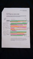
It'd been a while since I'd looked at the First Things First Manifesto, so I printed out copies of the 1964 and 2000 Manifestos to make notes on, as well as an article supporting it by Rick Poynor, a signatory of the 2000 Manifesto. 

What I Gained

I'd written down noted down presumptions about the Manifesto that I'd remembered thinking from last time I read it, and was looking for quotes that backed them up. I started with the 2000 manifesto because I remember it being a bit more negative than the original. I found that all the points I made in my notes were backed up by particular parts of the 2000 manifesto, and so in the 1964 one I looked for bits that were missing in the updated one to identify which of Garland's thoughts Adbusters deemed to be unnecessary, and then looked for explanations in Poynor's article. This is what I found: 

  1. 1964's Manifesto explicitly states that they don't want to get rid of consumerism, and tends to have a more positive attitude in general.
  2. 2000's Manifesto is very accusational of designers, blaming them for the growth of consumerist culture.
  3. 2000's Manifesto is a lot more politically based than 1964's.
  4. The 1964 Manifesto wasn't pre-planned and was a "heat of the moment" thing.
  5. Ken Garland was an active member of the Labour Party at the time of the 1964 Manifesto's publishing, and it gained the attention of Labour MP Tony Benn.

Potentially useful quotes:


Next Steps

Poynor was supportive of FTF, as would be expected from a signatory, so I now want to look for a fairly high-profile person who's critical of the manifesto to balance this out a bit, Michael Bierut seems like a good place to start. I also want to look into Johanna Drucker, the aritst/critic mentioned by Poynor who suggested that "the life and consciousness of the designer" are at stake by not following FTF.