Friday, 27 November 2015

Publication - Typeface Changes

Having started writing some of the content for my publication, I've found that some of the original decisions I made aren't as suitable in practice as they are in theory. 

The first change was that I altered the quotes from Quicksand to Gotham. I found that the decorative nature of Quicksand clashed with the titles and was too distracting from the body copy. Gotham is still a very modern font so fits the element of pastiche, but is more minimal while retaining similar character styles and sizes so it won't impact the hierarchy too much.

I also made the body copy smaller, as I found that even the small change of making it 9pt rather than 10pt made the chunks of text hold their shape a lot better both against the right side of the columns and around the quotes. It now is somewhat reminiscent of Derrida's Glas in how the text is split up.


Glas - Jacques Derrida


Thursday, 26 November 2015

Publication - Influences

Thus Spoke Zarathustra

The choice of stock was heavily influenced by the colouring of the pages due to the age of the copy of Thus Spoke Zarathustra I borrowed from the library, which was 55 years old. By finding a stock that had a similar colour and texture I hope to recreate an aged look.


On The Suffering of the World

The copy of Schopenhauer's On The Suffering of the World had I bought had a front cover on which every single word was debossed into the page, this gave the text an element of power and a sense of credibility that wasn't present in the text on the covers of any of the other books I read for this project. For this reason I want to try and create a similar effect for the text on the cover of my book.


Glas

Whilst Jacques Derrida's Glas wasn't a book I read, and I have no idea how relevant or otherwise it is to my project, it should be pointed out that the inconsistent and somewhat obscure layout of text in my publication is similar to that in Glas, which was something I've been made aware of recently.

Tuesday, 24 November 2015

Publication - Grid and Typographic Decisions

I wanted to use a fairly decorative blackletter font for the headings because the historical relevance of blackletter fonts is reflective of pastiche, and picking a decorative one goes against modernist principles. I looked at Teutonic and Germanica particularly, I chose Teutonic number 4 particularly because of it's mixture of decoration and weight.


I set a grid up using the golden spiral as a basis because it reflects existentialist thought because of links to unexplained natural beauty. The body copy is in Cochin because it's a traditional serif font but with a particularly low x-height which will make the text look less blocky and academic.


I decided that the pull quotes should be in a fairly modern sans-seif font so the aesthetic wasn't overly old-fashioned, as the idea of pastiche is to re-appropriate the past, not to purely copy it. I chose to use Quicksand because it also has a fairly low x-height and it's decorative features, which make it a suitable partner for Teutonic No4 and Cochin. 


None of the three fonts used are particularly common, so they back the idea of individuality and avoiding the eternal recurrence, things that wouldn't have been achieved had I chosen to use Helvetica, Futura, Garamond, Times, Didot etc etc.

Sunday, 22 November 2015

Practical Element - Design Decision Proposals

My publication will be a guide on how to use Nietzschean philosophy to transcend morality and ethics in graphic design in direct opposition to Lucienne Roberts' Good. The following proposals for the design of my publication make it suitable for the project:

  • The spine will be on the right, which will make it appear that the reader is reading the book backwards, which is important as it suggests they're un-learning something. This relates to Nietzsche's form of Nihilism as he believed that destruction was necessary in order to make way for creation.
  • The contents of the book will be ordered in such a way that it makes some sort of sense when read with the spine to the left, as those incapable of transcending tradition are incapable of becoming the Ubermensch. For this reason when read with the spine to the left the book will read more as an explanation of how the research for my essay was undertaken.
  • The publication needs to represent how Nietzsche's thoughts aren't based on traditional philosophy, and how they're generally seen as more accessible to the average person than the thoughts of most other philosophers because of this. For this reason I don't want the book to look overpoweringly academic at first glance, and so I intend to keep it quite short, hopefully under 50 pages.
  • My essay will be written up in a separate book that sits within the main publication in a similar way to how hip flasks are jokingly placed in Bible's (below), as this then makes the essay fully readable regardless of if the main publication is read with the spine to the left or to the right. By separating it from the rest of the content it's also an expression of my own will to power by highlighting my own academic work.
  • The layout of the pages will be based around a grid based on the golden ratio which reflects the acceptance that not everything can be understood by science that is also present in existential thought. For this reason, the book will be B format size (198mm x 129mm) as I've seen this size accommodates a golden ration based grid comfortably in my extended practice.
  • The pages will include larger pull-quotes to break up the larger bodies of text, which differentiates it from most other academically-based books, avoiding the layout taking on aspects of the eternal recurrence.
  • Aesthetically, the book will look quite old-fashioned to reflect the pastiche of the Ubermensch. This will be done by using serif fonts, bookbinding methods that result in an old fashioned look, and stock with an inconstant colour. All these things also avoid modernist principles which is a statement against the First Things First Manifesto in itself, as it was based on modernist ideology.


The ordering of the content will be as follows (spine to the right) for the publication to make sense when read both ways:
  • Introduction
  • Contents
  • Analysis of 1964 Manifesto
  • Analysis of 2000 Manifesto
  • Analysis of 2014 Manifesto
  • Discussion of Design For Life - Nigel Ball
  • Discussion of 10 Footnotes to a Manifesto - Michael Bierut
  • Discussion of the Effects of the 2102 Tobacco Advertising and Promotions Act
  • Discussion of work by Edenspiekermann
  • Discussion of work by Margaret Calvert
  • Discussion of Car and Drinks Advertising
  • Introduction to the Will to Power
  • Introduction to the Ubermensch
  • Introduction to the Eternal Recurrence
  • Discussion of Quotes from Human All Too Human
  • Discussion of Quotes from Beyond Good and Evil
  • Discussion of Quotes from The Gay Science
  • Discussion of Quotes from Thus Spoke Zarathustra
  • A Copy of my Dissertation

Essay First Draft

Wednesday, 18 November 2015

Re-Visiting Thus Spoke Zarathustra (Again) - Friedrich Nietzsche


Reasoning

After reading the journal articles, I decided I should re-visit "Of Self-Overcoming", a phrase mentioned throughout one of the articles, and "Of the Vision and the Riddle", a chapter referred too in one of the articles as the key chapter in Thus Spoke Zarathustra.

My previous notes on Thus Spoke Zarathustra can be found here and here.

What I Gained

Re-reading these chapters has jogged my memory, and some of the points raised in them can be used to improve the triangulation in my essay.

Potentially useful quotes:


Next Steps

Using these quotes and the journal articles from the previous post, I'm going to strengthen the discussion of the will to power, the Ubermensch, and the eternal recurrence, as well as the general triangulation in my essay.

Journal Articles - New German Critique & Journal of Nietzsche Studies


Reasoning

After discussing the 1st and 4th chapters of my essay with my tutor and after re-reading the first full draft of my essay myself, I realise I need to include more discussion of the will to power, the Ubermensch, and the eternal recurrence themselves, not just their applications to graphic design. The following articles helped me with this:
  • Nietzsche's "Will to Power": Politics Beyond (Hegelian) Recognition - John H. Smith
  • Nietzsche on Reality as Will to Power: Toward an "Organization-Struggle" Model - Ciano Aydin
  • Can One Really Become a "Free Spirit Par Excellence" or an Ubermensch? - Jacob Golomb
  • Finding the Ubermensch in Nietzsche's Genealogy of Morality - Paul S. Loeb
  • Nietzsche's Greatest Weight - Aaron Ridley

What I Gained

The articles provided me with more points for discussion writing chapters 2, 3 and 4, as well as increasing the strength of the triangulation in my essay.

Potentially useful quotes:


Next Steps

After adding some discussion of some of these points into my essay I'll start structuring the content of my practical work while awaiting feedback on the essay. I also want to re-read a couple of chapters of Thus Spoke Zarathustra again after reading these articles, particularly "Of Self-Overcoming" and "Of the Vision and the Riddle".

Tuesday, 10 November 2015

Refined Practical Work Proposal

Building on the previous proposal, I've decided that my publication will act as a Nietzschean answer to Lucienne Roberts' Good: An Introduction To Ethics In Graphic Design, which instead of educating about morality in graphic design, encourages reader to transcend it.

The publication will be a book, but will avoid the same principles of other books and avoid the modernist principles which are incompatible with the eternal recurrence. A key way of doing this is have the spine on the right, which will mean the reader will appear to be reading the book backwards, giving the impression they're trying to un-learn something. This is important, as Nietzsche's form of nihilism means that destruction is required before creation.

Whereas the methodology of my essay is to look at some of Nietzsche's thoughts and then apply them to the first things first manifesto through practical examples of graphic design, the book will work the opposite way round, using practical examples to try and discredit the manifesto, leaving the reader in a position where Nietzsche's philosophy will find meaning for them. This will then be confirmed by a copy of my dissertation at the end of the book. 

A side-product of this will be that if the book is read with the spine on the left, it will more start with my essay, and then more or less follow the path I took in my research, and so will still have meaning, albeit it not the intended one. This however is itself representative of Nietzsche's theory of the Ubermensch, as those who can't bring themselves to read the book in the correct manner (with the spine to the right) are clearly incapable of transcending tradition and so will be unable to create their own values.

Whilst these are major changes from the previous proposal, the fact that I'll have generated all the content for the publication means it still retains the element of it representing my own will to power through all the content coming directly from my research.

Friday, 6 November 2015

Case Study Research - Advertising Through Physical and Metaphysical Promises

Advertising generally tries to sell things through one of two ways, through promises of making your life physically better such as "this product will help you succeed in your goals", or through making metaphysical promises such as "this product will make you a happier person".

The Citroen C4 dancing car advert is an example of the latter. The contents of the avert is blatantly fictional, so you're not getting any physical promises from the advert. Instead, the advert is saying "this car is fun, it'll make your life more fun", a metaphysical promise. It doesn't actually tell you anything about the car, and so isn't really successful in terms of it's communication with the audience about the cars selling points.


A recent advert for the Toyota Auris is an example of the opposite. It plays on the fact that other car adverts tend to offer metaphysical speculations or subjective thoughts, and instead offers factual positives about the car, making the communication much clearer and more successful. Rather than "this car is fun, it'll make your life more fun", it's saying "this car is practical and will make driving easier for you", which is generally a much more powerful message when trying to sell a car.


This is applicable to most products. Coca-Cola's One World, One Game campaign that ran alongside the 2014 FIFA World Cup is another example of selling through metaphysical promises. The advert communicates very little about the product, instead it says "by buying Coca-Cola, you're helping people in poverty", which while it's a good message, isn't what's in the forefront of most consumers minds when buying a drink. It's also a somewhat hypocritical message given the recent tax problems the Coca-Cola company has had.


When you compare this to Lucozade's Fuel to Rule campaign the differences in the communication are similar to those in the car advert. Rather than selling the product on a metaphysical feeling of 'goodness', it's being sold on self-empowerment, communicating messages like "this drink makes you a more capable athlete", and so gives the consumer a physical reason to buy the drink.


Adverts such as these suggest that the most successful forms of communication are done through physical promises, which align with Danto's suggestion that when considered in the context of the will to power;

"Happiness, as far as it is relevant, is not separable from the struggle for power, for pleasure is simply the conscious reflection of the ascendancy of our strength"

This suggests that adverts that offer something physical like the Lucozade and Toyota ones are not only more successful in their communication, but also more likely to sell a product because happiness is found in physical things like power and success, not metaphysical ones. 

Sources

https://www.youtube.com/watch?v=4dilUbkP-PI
https://www.youtube.com/watch?v=2WI9wBrscUQ
https://www.youtube.com/watch?v=aMed07FEDEg
https://www.youtube.com/watch?v=jTNe4pTkg8g
http://www.taxjusticeblog.org/archive/2015/09/its_not_the_real_thing_coca-co.php#.Vjx96K7hB0s
DANTO, A. C. (1980). Nietzsche as Philosopher. Chichester: Columbia University Press.

Thursday, 5 November 2015

Case Study Research - Applications of Modernist Design and Pastiche

There are some fields of design that lend themselves towards modernist design more than others, and these are generally the sort of "cultural projects" referred to by the First Things First Manifesto. The general gist of the list of examples in both the 1964 and 2000 Manifesto's are the same, so the inclusion of street signs in the original would suggest that street signs would also be considered a cultural project by the 2000 edition. The UK's road signs were designed in 1963 by Jock Kinneir and Margaret Calvert. They kept the signs as simple as possible to make the message of each individual sign as clear as possible. The aesthetic this created was a modernist one, which goes a long way to explain why the system doesn't look out of place today.


Moscow Sans is the typeface and set of pictograms designed for the transport systems in Moscow in early 2015 by A2SWHK and Margaret Calvert. Despite the cultural differences between the UK 50 years ago and present day Moscow, the typefaces, pictograms, and the application of Moscow Sans is, like the UK road signs, modernist. The fact that both are successful is an indication that signage in general needs to be modernist to some extent to work successfully. On top of this, the fact that Margaret Calvert, now approaching 80 years old, is still involved in this element of design 52 years on from when she worked on the British system, is somewhat of an indication of Michael Bierut's implied suggestion that this sort of work is only done by a narrow selection of designers;

"Most of the thirty-five signatories are names that will be unfamiliar to the average rank-and-file american graphic designer. Many of them built their reputations by doing “cultural” work on the fringes of commercial graphic design practice as critics, curators, and academics. As designers, their clients generally have been institutions like museums and publishers, rather than manufacturers of nasty things like triple-edged razors, cigarettes, and cereal." 

This is somewhat contradictory to the idea making communication free and accessible to everyone as suggested in the 2000 Manifesto. 


On the opposite side of this coin there is the fact that there are some fields of design where modernism isn't appropriate. The extreme modernism of the Morrisons Savers range, which is commercial embodiment of accessibility, is somewhat reminiscent of Michael Bierut's invitations for the International Design Centre, arguably a 'cultural project'.


However, the Morrisons Savers design is clearly unsuitable for products such as Vodka and Whisky, which rely on the connotations of their branding to make them desirable. Products such as these now have their own connotations, such as poverty, desperation, and alcoholism, because of their low price, which is made possible because of the lack of commercial activity behind the product. Such connotations stop people form buying the products more often than not, making the design unsuitable.


When the Morrisons Savers brand of Vodka and Whisky are compared with Smirnoff and Jack Daniels respectively, the difference in connotations are clear. The use of pastiche in the branding provides connotations of history, power, and success, which, when combined with the more refined and aesthetically pleasing visuals make it a much more desirable product, and therefore the branding is more successful, and crucially, more skilful.


Pastiche is also useful in cultural design though, as it's ability to appropriate historical messages and tone help spread a message. A good example of this is the Guerrilla Girls reappropriating their own poster design, in doing so they're using the historical context of the 1989 version to suggest to problem raised in the 2014 version is outdated, while still using the iconic design of the original poster. 


Pastiche can even be applied to the technique behind a design as opposed to the visuals of it. This placard was used in a protest rally against Putin's anti-gay rights policies in Moscow early 2015, and was the first time the LBGT flag was used in the protests. The text reads "We won’t give it to Putin a third time", and the obvious home-made look of the placard brings with it connotations of innocence, which isn't something you'd necessarily associate with the LGBT flag, which normally is about pride and passion. The innocence allows a much more emotional connection than a more professionally made placard, which makes it successful.


These examples show how pastiche can be used effectively on all sorts of projects, whereas modernism tends to be a bit more discriminative as to what projects are suitable. 

Sources

http://www.eyemagazine.com/feature/article/the-way-ahead
http://www.bbc.co.uk/news/magazine-15990443
http://www.itsnicethat.com/articles/a2swhk-moscow
http://www.aiga.org/medalist-michaelbierut/
http://www.vam.ac.uk/blog/section/disobedient-objects
https://groceries.morrisons.com/webshop/startWebshop.do 
BIERUT, M. (2007). 79 Short Essays on Design. New York: Princeton Architectural Press.

Wednesday, 4 November 2015

Case Study Research - Edenspiekermann and MetaDesign

Edenspiekermann and MetaDesign are design agencies heavily influenced by Erik Spiekermann, one of the most well-known and successful signatories of the 2000 First Things First Manifesto.

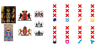
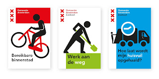
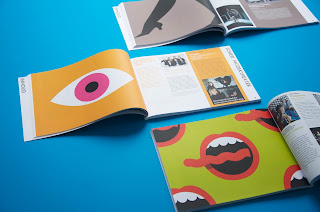
The below images are work done by offices of Edenspiekermann in Berlin, Singapore, and Amesterdam for Optivo, The City of Amsterdam, and Utrecht City Theatre respectively. Their similar aesthetics despite their different head designers are examples of how modernist design tends to look very similar and easily replicated.

Eddie Pillers description summary of a modernist lifestyle is “an aphorism for clean living under difficult circumstances”, which, if extended into Graphic Design would suggest that Edenspeikermann have allowed, to some extend, modernist principles to become more important that result of following the principles. 

If this is the case then you would expect Spiekermann himself to be very committed to the other principles of the 2000 First Things First Manifesto, such as the opposition of commercialist culture. Despite this, MetaDesign, a company founded by Spiekermann himself, have clients including Bosch, Volkswagen, Raiffeisen, Audi, Karcher, Coca-Cola, Siemens, and Lacoste.

This is a practical example of how First Things First's ideology is nothing more than an ideology, it's impossible to work in practice because of how capitalism works, which is undermining of the anti-capitalist message set by the 2000 First Things First Manifesto.

Optivo (Link)


City of Amsterdam (Link)


Utrecht City Theatre (Link)


Sources

http://www.edenspiekermann.com/
http://sanfrancisco.metadesign.com/
https://vimeo.com/52431977